
Gel, Color and Contrast – Peter Bielack’s Flashtime Using Quadralite Gear
We invite you to explore another installment of Flashtime created by Peter Bielack using Quadralite gear. Have you ever wondered why, on most posters featuring movie superheroes, yellow appears next to blue? “Because contrast,” you might say. […]
We invite you to explore another installment of Flashtime created by Peter Bielack using Quadralite gear.
Have you ever wondered why, on most posters featuring movie superheroes, yellow appears next to blue? “Because contrast,” you might say. Of course, but why? What is so special about blues and yellows that they affect our sense of sight in this way and evoke such emotions in our brains? Maria Rzepińska devotes a lot of space to this subject in her History of Color, especially when she writes about Goethe’s genius and his monumental work, Farbenlehre. I talked about all of this during Flashtime – if you haven’t seen it yet, now is your chance to catch up.
The concept and preparations for the photo shoot
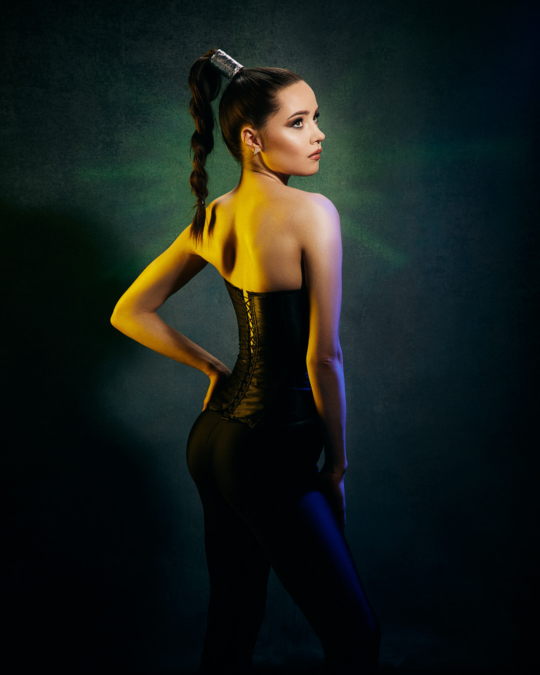
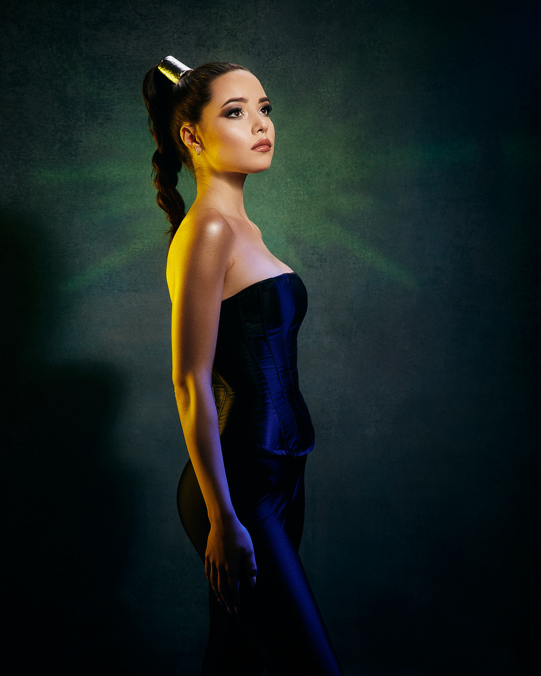
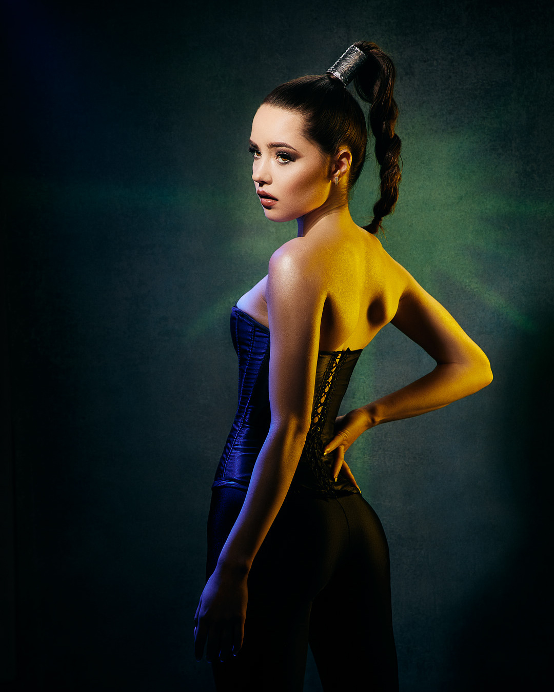
I’m very fond of sci-fi and fantasy cinema, which is why I see yellow-and-blue posters very often. If it’s not yellow and blue, then it’s orange and turquoise; Teal&Orange, Instagram’s flagship combination. It’s safe to say that my idea of rim-lighting the model with yellow and blue is not original, but even an overused idea can be executed in a way that leaves a part of yourself in it.
Lighting setup simulation
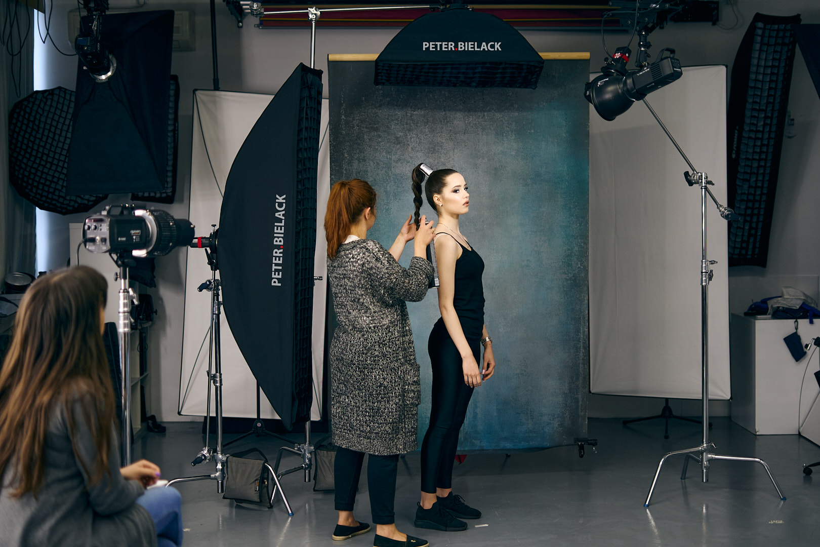
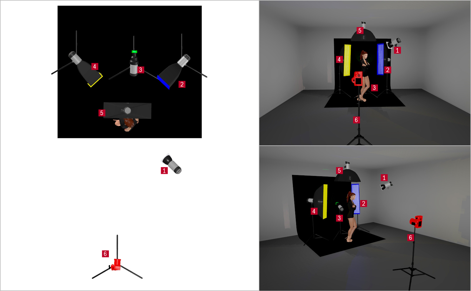
As a thought exercise, I designed a lighting setup that would allow me to show plenty of shadow: from the left side, I would wash the model with yellow light. Yellow is a warm color, so it will be seen first, and will appear brighter and closer. On the other side, I would accent the model’s silhouette with a cool blue, and even though the lights would have the same power, the blue would appear weaker and would also create a sense of distance. This bright-warm and darker-cool contrast would help me build a sense of three-dimensionality in a two-dimensional photo.
I knew that when planning to shoot with colored gels, I would have to use grids on all modifiers; grids prevent light from spilling to the sides and create a lot of shadow, and it is shadow that creates the mood—plus, color appears in the shadows.
I prepared a five-light lighting setup simulation:
- 1. Main Light,
- 2. Kicker Light, i.e. lighting the model from the right side (with a blue filter),
- 3. Background Light, i.e. lighting the background behind the model,
- 4. Kicker Light, i.e. lighting the model from the left side (with a yellow filter),
- 5. Hair Light,
My model has a beautiful face and very regular features, which is why I decided on very hard main light; instead of a beauty dish, I used a standard 60˚ reflector – the least expensive modifier, the one we usually get together with the flash.
Flashtime, or a photo shoot streamed live via Instagram
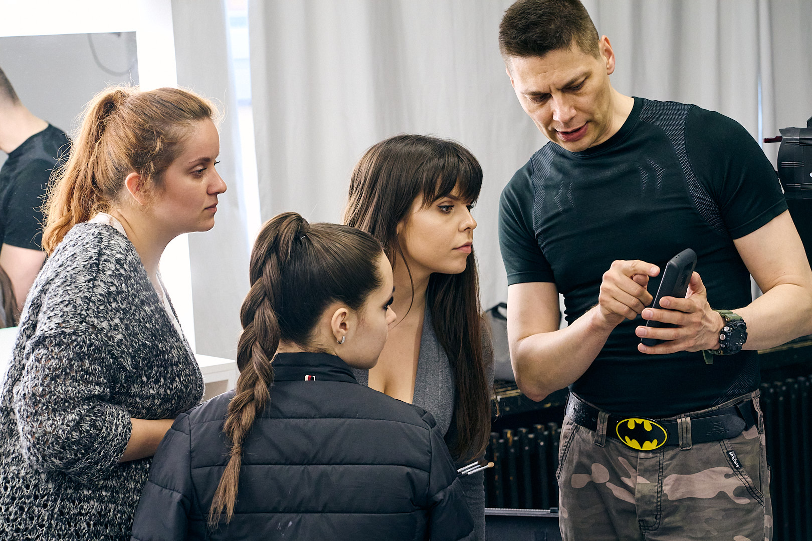
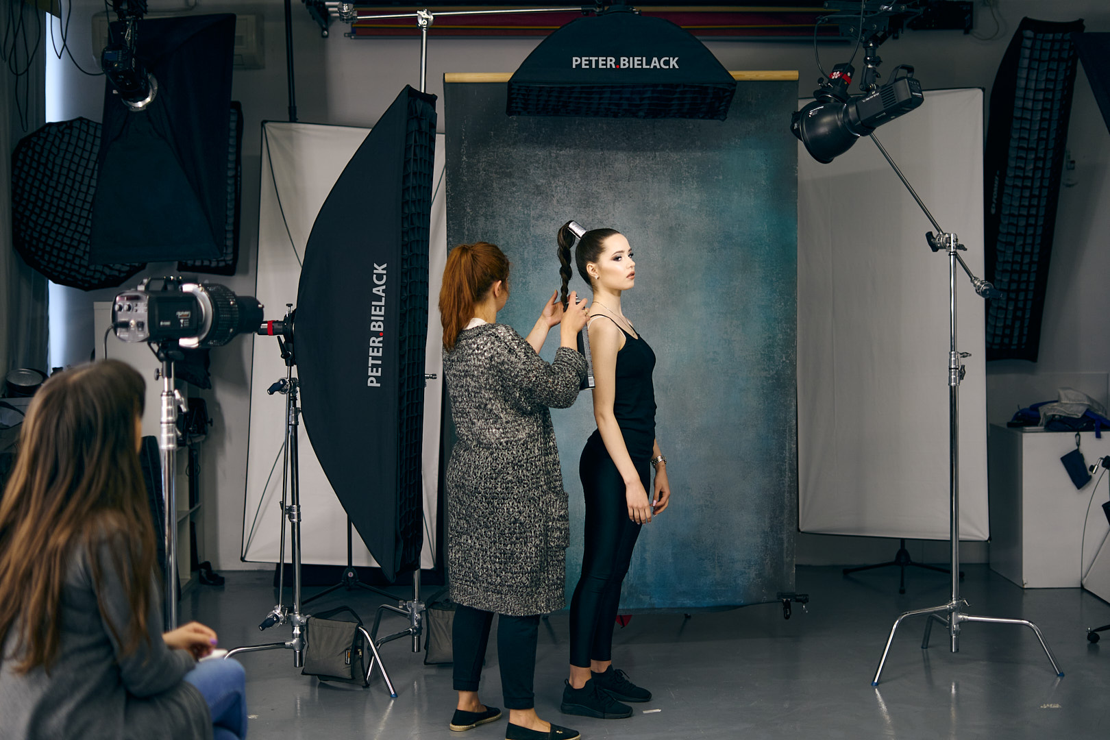
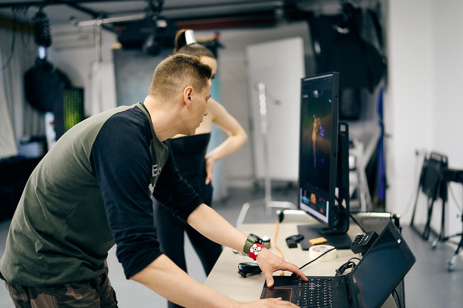
Even the most carefully prepared simulations remain just simulations; no software is perfect, so while my model was being prepared for the shoot by the makeup artist and hairstylist, I was making a few further, minor modifications:
- Instead of a stripbox on the right, I mounted another classic reflector on the light; the stripbox was also casting blue light onto the model’s face and neck, which I didn’t want. A reflector with a grid has a much more limited light spread.
- I had to move the Spot SN-5000 projector quite far back in order to scale the size of the shape appearing behind the model appropriately.
Final lighting setup
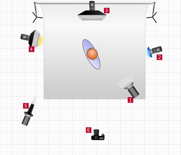
- 1. Quadralite Atlas 400 PRO TTL + Reflector 60º + Grid,
- 2. Quadralite Reporter 200 TTL + Reflector 60º + Grid + Blue Gel,
- 3. Quadralite Reporter 200 TTL + Stripbox 90×30 cm,
- 4. Quadralite Reporter 200 TTL + Stripbox 120×30 cm + Yellow Gel,
- 5. Quadralite Spot SN-5000 + GoBo + Green Gel,
- 6. Canon EOS R + RF 24-105mm F4L IS USM,
The author of this guide is Peter Bielack. More information about the shoot can be found on the author’s blog
Instagram: peter.bielack
WWW: bielack.photo
Youtube: Peter Bielack
Facebook: peter.bielack.photo